 Blink of an Eye by Gregg Luke
Publisher: Covenant
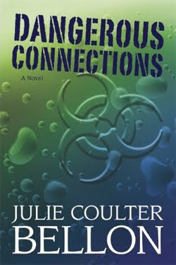
LDSP comment: I chose this one because of the gradient colors , the water drops, and that image in the center. My first thought was, “What the heck is that?” Then I realized, oh. Biochemical warfare. Awesome! Once again, the image here does not do the cover justice. The colors in real life are more eye-catching. I like the white author name, size and placement. I’m not as thrilled with the font choice of the title. Even though it’s the kind of type you’d see on army boxes, it still seems…odd. Maybe it’s more the size, color and placement that is off for me, rather than the font. Opinions?
 Deadline by Clair M. Poulson
Publisher: Covenant
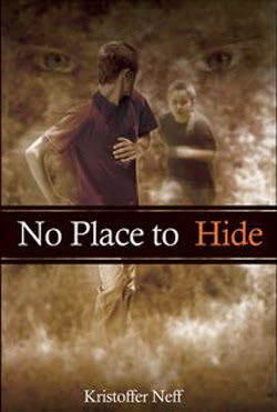
LDSP comment: This one gets the “ooo! creepy…” my award. From the title up, it works for me. Those eyes behind the boys are just awesomely evil. *shiver* However, I find that my eyes never really make it to that bottom third of the cover. Wasted space.
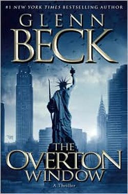
LDSP comment: Political Thriller. You’d know that from the cover, even if it didn’t say “A Thriller” under the title. I have no idea what the Statue of Liberty is holding in her left hand, but the cover makes me want to find out. I like the blue. I like the placement of elements. And I really like those birds. (Visions of Hitchcock, anyone?)


Why wasn't Cold As Ice in here? That cover gave me chills each and every time I saw it. I picked Dangerous Connections because I like the imagery it brings to mind.
I debated back and forth between Blink of an Eye and Deadline, and finally went with Deadline. I think it speaks to the writer in my and man, if my publisher's deadline meant to live or die, you better be sure I'd have it done! (I have no clue what the book was about – but love the cover!)
I agree with TJ. Where's Cold As Ice? It's a great cover!
I debated a long time because I like Cold as Ice too but I felt these covers were just a little more…intriguing? Mysterious?
I voted for the cover of The Overton Window because the Statue of Liberty and the NY City skyline really caught my eye. What is the statue holding in her left hand? I'll have to read the book to find out.
I wasn't that thrilled with any of these, but I went with Deadline because I liked the picture's simplicity and clarity and the red caught my eye more than the colors in the other covers.
I voted for Deadline. It is simple and draws your attention.
Charlie
Deadline got my vote too.