LDSP comment: I have to say that I really like all the covers I picked in this category. REALLY LIKED.
 Alcataz versus The Shattered Lens by Brandon Sanderson
LDSP comment: I love that giant robot thing. I love that we only see it from waist down. That is so awesome! It loses a few points for me because the two characters get lost in the awesomeness of the robot legs. Also, while I like the placement of the word Alcatraz, the rest of the title feels cluttery to me. Also, the author’s name just sort of hangs there at the bottom. Not sure what I’d have done differently, just giving my opinion on what is.
LDSP comment: Love this cover. Love the image. Love the fonts. Love the placement of elements. The only thing I’d do differently is make the title stand out a bit more—which it does if you see the book in person—but still, it gets a little lost for me.
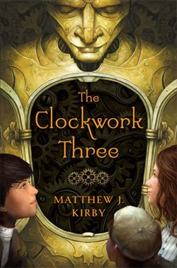
LDSP comment: My favorite cover in this genre category! I LOVE that robot guy. (Hmmm, yes, I guess I have a thing for robot guys.) I love that his chest opens up to reveal clockworks and the title/author. I like that we see the kids looking in. One glance and we know this is a Middle Grade fantasy. Yep! Winner. The one thing I’d change is the font choice for the title. I’d go with something a little more substantial.
I like the UK version even better. If I’d seen it before the contest, it would have been here instead.
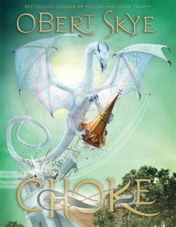
LDSP comment: A very nice cover. Love the title font and placement. Love the image. Love everything about it. It just didn’t grab me quite as much as Clockwork Three or …
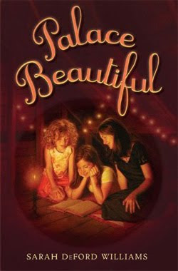
 Palace Beautiful by Sarah DeFord Williams
Publisher: Putnam Juvenile


Loved Choke! Really pretty cover!
The cover of Alcatraz versus the Shattered Lens will appeal to young readers. I think they will want to read about the robot monster. It's a winner.
I liked the children on Clockwork Three and the way the light is cast and for some reason I can't really explain, the mechanical face said "Egypt" to me, and since I Iove historical things (and all the rest of this picture), I chose this one.
I really loved cover of The Healing Spell. I want to know what that girl is thinking in the boat. All of the green in the cover really draws your eye.
Have you seen the UK cover for The Clockwork Three? It is similar, but I like it even better.