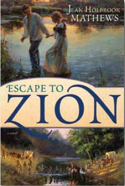
LDSP comment: I liked the old-fashioned feel of this cover. I especially liked the image at the top. I would have done more with that. I didn’t much care for the bottom image or the title banner that cuts the cover in half. But overall, it was enough to catch my eye and find a place in the contest.
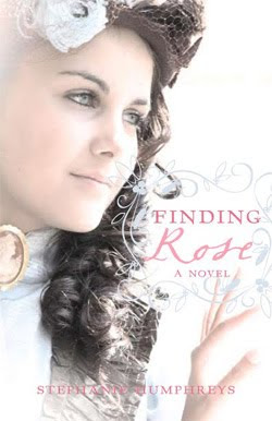
LDSP comment: Finding Rose is a lovely cover. I like the girl. Sometimes in photos like this, the model is wearing too much make-up. This one is a tad heavy on the mascara and her eyebrows are plucked a little too modernly, but I can live with that. In real life, the pink on the cover stands out a bit more, making it even prettier. I like the faded edges, the title fonts and the scroll work.
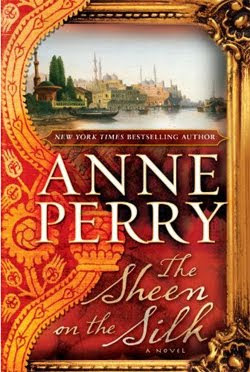
LDSP comment: The thing I like most about this cover is the vivid colors. You don’t see that a lot on historical covers—and I love it. For that reason alone, it got a place in the finalists. Overall, it didn’t win my vote because I think it’s too busy, the author’s name is too big, and the title is sort of wimpy and lost in the design.
 The Water Is Wide by Marianne Monson
Publisher: Deseret Book
LDSP comment: I really, really like this cover and it’s my winner in this category. It’s got a lot going on without being too busy for me. The placement of the title and the “A Novel” is perfect. I love the font choices and that cameo inserted for the ‘O’. The train, the letter and the seal place us squarely in the appropriate time period. Everything about it works for me.


I find it fascinating how much tastes in covers vary! After I vote, it's sometimes surprising to see what a large percentage of other voters disagreed with me 🙂
The Widower's Wife: I like trains. Good enough of a reason in my book.
I actually didn't like any of the historical novel covers very much. I voted for the one that was most appealing – Escape to Zion – because I like the art/painting feel. But really, none of them were "awesome" in my opinion.
Danyelle, was there one you would have put on this list that I missed? Which one? Curious.
I was intrigued by the picture of the train also, and the sealed letter. If I saw it on a shelf at the library or in a bood store, I'd pick it up to read the back cover.
Now, see? I'm just the opposite. By the time trains come around, my interest in the historical time period has plunged, so the train immediately turned me off. The water color effect of Escape to Zion is pretty, but I tend to like clear, sharp images on my book covers. I liked a lot about The Water is Wide, but I didn't care for the sepia color, even though I'm sure that was part of the cover's deliberate effect. I loved the colors on both The Sheen on the Silk and Finding Rose, but in the end, I went with the pastels because I thought they and the woman were pretty. Just more of my highly subjective very personal opinion.
I agree with TJ. I also vote for The Widower's Wife for the same reason.
Charlie
Escape to Zion, Sheen on the Silk, and Widowers Wife were all nicely done, but none of them were as compelling as The Silence of God. That cover immediately grabbed my attention.
Jennie, I really debated on The Silence of God. It was in the running. The title grabbed me and I certainly felt that all that snowy white worked with the title to evoke the feeling of silence. However, in the end I went with another because to me, the cover didn't say "historical."
(Yes, I know the palace is historical, but it didn't quite do it for me.)
And Finding Rose did? What's historical about a girl in a wedding dress wearing a cameo? Lots of modern women, including brides wear cameos.
LOL! Got a point there Jennie. 🙂
Maybe you should pick your favorite covers from 2010 and do a Meridian post about it. I'd love to see what you'd choose as your top 10.