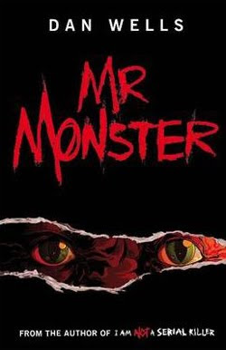
LDSP comment: Winner! Winner! Winner! I loved this cover the moment I laid eyes on it early this year, and I still love this cover. The colors. The ripped paper. The eyes. Yep! This is probably my second favorite all-time cover for 2010. And yep, it’s totally and completely subjective. I can’t even explain why I like it so much, I just do!
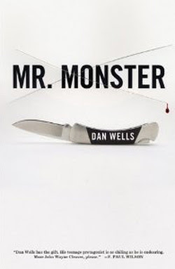
LDSP comment: If I’d never seen the UK version of this cover, this would have been my winner in this category. I’ve talked with Dan Wells (in my daytime, alter-ego persona) and he likes this cover better. There are really cool aspects to this cover, like his name on the knife. And the one little drop of blood. But still…I like UK better. Sorry, Dan.
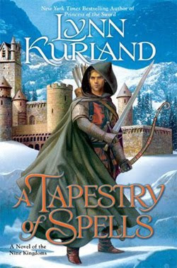
LDSP comment: If this were a medieval romance, it would have never made finalist for me. The girl on the cover is too modern looking. But since it’s speculative, I’m letting that slide. She really is quite lovely. I like the title fontage and placement as an element. The castle in the background is almost too much, too busy. But overall, I like it.
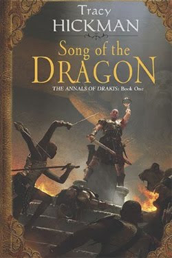
LDSP comment: Hickman covers have never been my favorites. They are generally too busy and the illustration too complicated for my tastes. But I really like this one. It’s simpler and cleaner, with my eye making a smooth transition from top to bottom, instead of leaping around all over the place. Hope his future covers are more like this one.
LDSP comment: This is a more traditional epic fantasy cover. I like the colors. I’m really into blue this year. I like the placement of the image. It grabbed my attention right away so much that I didn’t even really need to read the author name or title—but I did eventually notice them. I really like the font they’ve used in this series.


.
The US Mr Monster cover is one of my favorite covers of the year period.
I agree that the US Mr Monster is awesome. And it's why I voted for it. It conveys creepy. The end.
I doubt two covers for the same book will ever show up again—and the only reason I even know about the UK cover is because it was released first and I picked it up at last year's LDStorymakers conference.
And I like both of them. I'll tell you which I like better and why after the contest is over.
My favorite was Queen in Exhile. It was one of my favorite covers this year. The UK version of Mr. Monster is my second fave in this category. I actually don't like the US version.
My favorite is the cover of A Tapestry of Spells because the young man in the cape holding his weapons is intriguing. I want to read his story. I like the mountains, the castle and the snow too. It's not a very original cover but it's eye-appealing and will trigger the book-browser's curiosity.
I've loved the cover of Queen in Exile from the first time I saw it. I was very happy to find it on this list.
I guess the Mr. Monster cover is effective. It's enough to convince me I don't want to read it or even look at it.