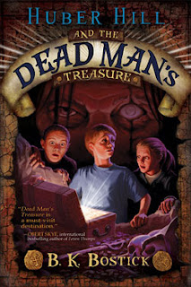
Realistic, as in more realistic than straight fantasy, although a
few of these have some fantastical elements to them.
few of these have some fantastical elements to them.
Please vote for your favorite cover using the poll at the bottom of the post.
Remember, we’re voting for the COVER, not the story or the author.
Voting deadline: Midnight, Friday, February 10, 2012.
Publisher: Peachtree Publishers
Cover Design: Barry Moser
What I liked about this one is the traditional illustrative look and feel of it. I love the nose-to-nose of the cat and mouse which brings the focus right there. I also like the curved type of the title and subtitle. And the illustrations on the inside are darling! (Click the link on the title to go to Amazon, then click the “Look Inside!” option.)
Publisher: Cedar Fort
Cover Design: Brian Halley
I love that creepy guy behind the children. That grabbed my attention right away. The cloudy eyeball totally freaks me out—in a deliciously hideous sort of way. This would be a book that I would have stored face down when I was in elementary school. The one downside to this cover, in my opinion, is it feels a little busy. There’s too much going on for me to have chosen it as the best in this category. But still, it gives me the creepy shivers every single time I look at it, so it HAD to be a finalist.
Publisher: Cedar Fort
Cover Design: Rachel Sharp/Megan Whittier
This cover would really have appealed to son when he was younger. I think the cartoony look to it grabs the attention of readers who want something fun, but not too deep. I like the illustration of the boy on the front. And I love those paint splats. Fun!
Publisher: Grosset & Dunlap
Cover Design: Sally Gardner
I have really enjoyed all the covers in the Splurch Academy series. I think Sally Gardner does a great job illustrating these books. This one, however, has something special to it. I love the yellow that brings your eye right to the boy. I also love all those tentacles coming out of the pool. I think this cover hits the target reader perfectly.
Publisher: Cedar Fort
Cover Design: Jen Boss
I haven’t read this book so I don’t know if the cover matches what is inside but the title and the cover design match perfectly! Everything about it evokes long and lazy summer days, walking barefoot, maybe splashing around a swimming hole or picking strawberries. I love the girl’s face and that big floppy hat. I love the font choices for the title, the mountains in the background, the farm, the swirly stuff. Often when you have this many items on a cover to look it, it can feel crowded and busy but this one just worked for me. I love everything about it and that’s why it’s my pick for this genre.


One thought on “2011 Children/Middle Grade Realistic Book Covers”
Comments are closed.