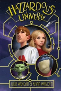
Please vote for your favorite cover using the poll at the bottom of the post.
Remember, we’re voting for the COVER, not the story or the author.
Voting deadline: Midnight, Friday, February 10, 2012.
Voting guidelines & details here.
Hazzardous Universe by Julie Wright
Publisher: Covenant
Book Art: Kevin Wasden
This is a fun cover. I like the font choice. I love the connecting lines that look sort of like alien circuitry. (Not that I really know what alien circuitry would look like, but it gives me that feeling.) I love the placement of the two kids in the center, and the stylized illustrations. I also love the two aliens. They’re fun and add to the cover without taking away from the human children. The internal illustrations are great too.
The Horn of Moran by M.L. Forman
Publisher: Shadow Mountain
Book Cover: ??
I love the colors on this one. I like the blue and purple together. I love the font choice for the title. I like the illustration and the way that face is sort of hidden in the black swoosh. (How many of you missed that? I did the first several times I looked at it.) I think this would definitely appeal to 9 to 12 year old fantasy readers. The series title, Adventurers Wanted, gets a little lost there at the top, but otherwise, this is really cool.
Janitors by Tyler Whitesides
Publisher: Shadow Mountain
Book Cover: Brandon Dorman
Now this is one awesome cover! I think it’s the best one by Brandon Dorman that I’ve seen. Great colors. Great illustration. It feels very 3D to me—those muscles just bulge off the page and the steam from the mop pot seems to flow right out at me. I love the title font and the way the “T” was done, but the author’s name gets a little lost in the image. Otherwise, Totally Cool! This was almost a tie. I went back and forth for a long time between this cover and the one I finally chose, so I’m very glad it won the Readers’ Choice award for the genre.
Return to Exile by E.J. Patten
Publisher: Simon & Schuster Books For Young Readers
Book Cover: John Rocco
This is my choice for the genre winner. Why did I pick it over Janitors? Because it gives me a little more information. The boy is running, as if he’s being chased. That creepy tree and those creepy birds are pretty awesome. But the think that got it for me? The steampunk/clockworks imagery. I don’t know if the story is steampunk at all (it’s still on my To Read list) but the cover is fascinating and creates all sorts of questions in my mind: What’s he running from? Is he the hunter or the hunted? What do those clockworks have to do with the story? And Return to Exile? Really? Why? The cover alone put it on my reading list—and that’s what a cover is for. Great job.
Skipping Stones at the Center of the Earth by Andy Hueller
Publisher: Cedar Fort
Book Cover: Angela D. Olsen
I love this cover. It, too, has a 3D feel to it. I like the dark red clouds (I’m assuming magma) at the top and the way the building gradually appears out of them and draws your eye down to the center of the image of the boy skipping rocks. I like how the rocks and the water are bigger, giving the image the feeling of depth. The only issue I have is that it’s got an awfully long title that sort of takes over the cover. But given that, the the designer did a great job curving that top line of text down, then using the word Earth to almost point our eye down to the central image. Very well done.


I really loved the colors for The Horn of Moran. They evoke a cool mystery without smashing you in the face.
Janitors was my second choice.