 The FOB Bible by Eric W. Jepson, et al
Publisher: Peculiar Pages
 Hotel on the Corner of Bitter and Sweet by Jamie Ford
Publisher: Ballantine Books
 The Ties That Bind by Kristen McKendry
Publisher: Covenant
Vote for your favorite in the VIZU poll on the sidebar.


I like the Hotel on the corner of Bitter and Sweet. I think the tones and contrasts of the picture draw the eye, and the umbrellas give a sense of mystery, and yet romance as well. Lots of really neat covers though.
That's my favorite cover as well–although they're all good. That one has a sense of nostalgia, emotion, history (and a tad of culture, with the Japanese parasol) to it that draws the reader (or at least me) in. I think the color has something to do with it, but I'm no artist, so I don't know the right terms.
I like The Route Cover because it invites the reader to see older people as vibrant, hopeful, and doing things. I like the way it shows light instead of darkness concerning older people.
I dunno — there's just something about a man with wings that appeals to me. Even if, on second viewing, they do appear to be coming out of the back of his head. It's intriguing enough to me that I'd like to pick up the book and see what it's all about. Even if it does say "The Bible" on the front, it makes me wonder, is that really The Bible that I know, or is it something different?
On the other hand, I also like the cover of The Route specifically because it is an older woman, not a beautiful young model, and she looks like she's just finished doing something that's made her feel quite satisfied.
This is a hard one to choose.
I like Hotel because the cover looks warm and inviting. It makes me feel like I want to burrow under a blanket and sink into the book for a few hours.
.
I've long loved The Fob Bible's cover, but the Hotel cover is also quite good. When I went through the covers last week thinking about my favorites, somehow I missed that one.
I voted by The Ties that Bind (although it was tough because I LOVE the cover for Hotel on the corner of Bitter and Sweet) but I felt that the watch was very evocative. It is both simple and intense.
Out of these I personally like the FOB cover because it reminds me of the old woodcut art and it is just different.
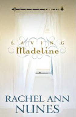
I vote for Saving Madeline. The light coming through the window and the title font are eye-catching. It invites you to open the book and find out more.
Hotel on the corner of bitter and sweet
Hotel on Bitter and Sweet. I'm with Annette, the mood is truly nostalgic and I too love the parasols.
The "Hotel" book has an awesome cover (and it's a fabulous read).
My fav in this category was Hotel on the Corner of Bitter and Sweet. I love the colors and the imagery. It gives that bittersweet feel just looking at it.
A close second was The FOB Bible. I liked the woodcut look to it. Even though it's not colorful, I liked the colors. It has the feel of an illuminated Bible.
The Ties That Bind got it for the watch. It's simple and elegant and there's something intriguing about it.
I love the woman on the front of The Route. She seems like someone I'd love to visit with — open, inviting, friendly.
I liked the open breezy feel of Saving Madeline and the scroll work behind the title, although I think it's a little too small.