Please vote for your favorite cover using the poll at the bottom of the post.
Remember, we’re voting for the COVER, not the story or the author.
Voting deadline: Midnight, Friday, February 10, 2012.
Publisher: Dutton Juvenile
Cover Design: Abby Kuperstock
I love everything about this cover! I love the colors—the hot pink and blue and green. I love the way the books are subdued and faded, while the illustration of the girl and boy legs pop. And the pink! I love the way the girl is up on her toe, with that one leg lifting behind her just a bit. I love those pink tennies. (I want a pair.) I love the little cloud in the middle with the title in a font that looks like a girls handwriting. I love the way the author’s name is on the stool. Everything about this cover just speaks to me. Very appealing to the target reader. And pink! Did I mention the cute pink?!
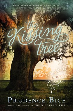
Publisher: Cedar Fort
Cover Design: Angela D. Olsen
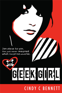
This cover is just all sorts of awesome. It was a very close call for me between this one and the one above. I love the red and black together. It’s strong and powerful. The girl’s face is strong and powerful. I love the skull in the heart. And I love the way the title is done. The author’s name is in the right spot to balance the rest of the cover. Very, very good. I bought it based on the cover. Yes, I did.
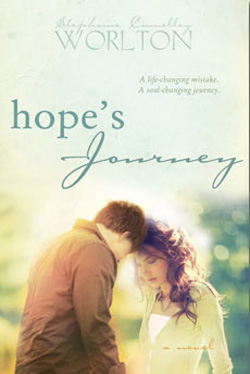
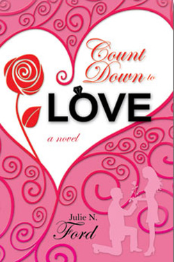
Publisher: Cedar Fort
Cover Design: Angela D. Olsen
The best thing about this cover is how it goes from very soft and romantic at the top to darker and more intense at the bottom. I love that. It’s sort of like moving from the fantasy of being in love into the sometimes difficult consequences of real life. Good flow bringing your eye down to the central image at the bottom, without rushing past the title. I like the variation in the font for the title. It’s pretty and it feels right. I like the image of the cover and the way the sun creates a halo around them. Good job.
Publisher: Cedar For
Cover Design: Danie Romrell
I like the main image of the girl being full color and solid. There she is, rooted in the present. I love the girl. I love the expression in her eyes, that deep in thought look. I like that whispery wagon wheel at the top, a faded reality that’s already in the past. I like the torn journal page that frames the title and author name, and an image from the past is echoed at the bottom. I like the two font choices for the title, especially the “rock”—that is visually cool.
Publisher: St. Martin’s Griffin
Cover Design: ??
This cover prompts questions in my mind. Her face is hidden, both by her hair and the cropping of the image, but her mouth is open that makes me think she’s confused or in shock. I want to know why. She looks like a regular girl—not drop-dead gorgeous. Just plain and ordinary. But the title is Miles from Ordinary. Hmmm. Intriguing. I like that a relatively ordinary font was chosen for the title, but it’s just a little different…a little rounder on the edges, a little taller. Not quite ordinary. All of that pulls me in and makes me want to know her story. (In this image, the author’s name gets lost on the cover, but it pops just enough on the real cover.)